Choosing eyewear colours can be tricky – there are so many shades to choose from!
An easy way to narrow down the options is to choose glasses that complement your hair, skin and eye colours.
There are 2 important factors to consider before you start choosing the colour of your frames:
- Do I suit warm or cool colours?
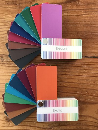
Your answer influences the undertone of the colours you choose. How do you know which colours suit you? Coral suits people with warm, yellow-based undertones. Fuchsia suits cool, blue-based undertones. Or, you can use your comprehensive colour swatch to guide you.
- Do I want my glasses to work with my natural colour palette or do I want them to make a bold statement?
Below you will find ideas about how to choose frame colours that work in harmony with you. If you have a style personality that enjoys creative, more dramatic, or fun looks – go ahead – break ‘the rules’!
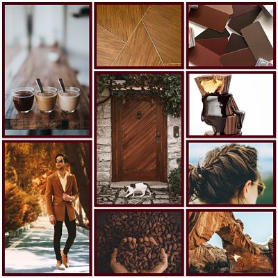
Eyewear Colours – Take Inspiration from Your Locks
Look at the different variations of highlights and deeper colours in your hair. Any of these shades will look fabulous as a frame colour.
Tip: Do you have a wide range of light and medium or dark tones in your hair? Tortoiseshell frames could be a great choice.
Black and dark brown hair – deep, dark colours, including black, will look striking on you. Avoid pale, ashy colours.
Light brown hair – If your hair is warm brown choose russet tones, camel, deep taupe. Cool brown hair? Select rose brown, blue-greys.
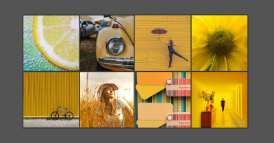
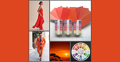
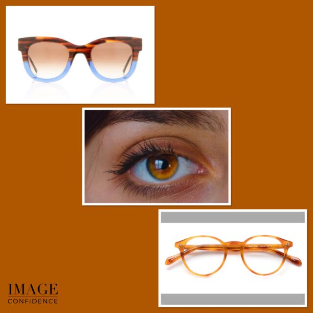
Red hair – rich tans and umber, reddish and chocolate browns – colours inspired by nature (think Autumn leaves). Brighter orange hair will tolerate more vibrant hues.
Blonde hair – Warm blondes suit honey, caramel, cinnamon, peach, and gold coloured frames. Whereas, cool blondes shine in rose beige, deep taupe, soft pink and silver.
Tip: black can look harsh if your overall colouring is light.


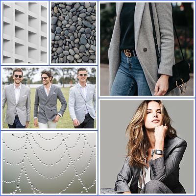
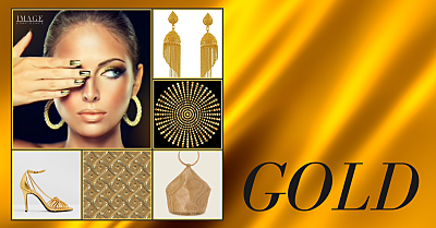
Grey hair – Is the undertone of your grey warm or cool? Warm (yellow-based) grey will look terrific in brushed gold glasses (a lacklustre version of yellow gold). Cool greys suit silver frames. Avoid yellow and brown frames.
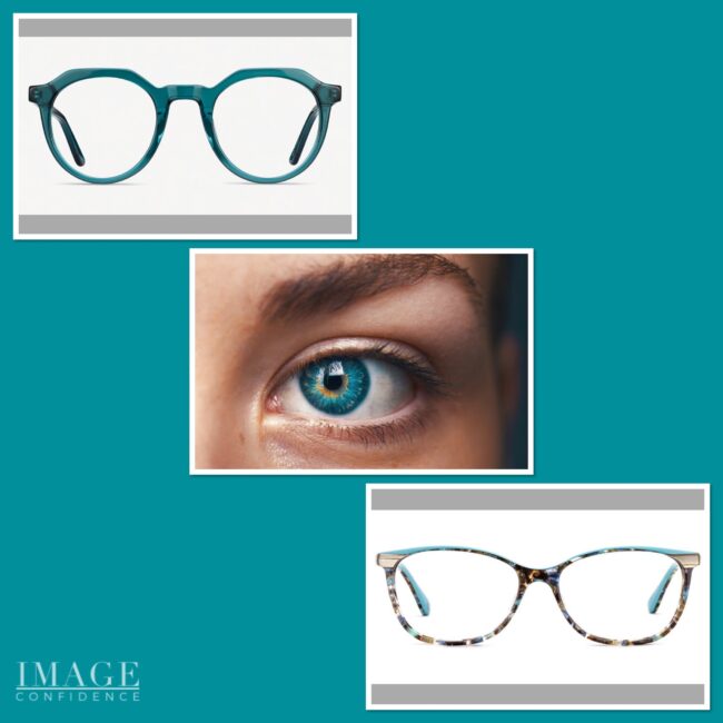
Best Glasses Frames To Enhance Your Eyes
Have a close look at your eyes. What colours do you see? Choosing frames that are like the colours in your eyes will make them ‘pop’. These are called eye enhancers.
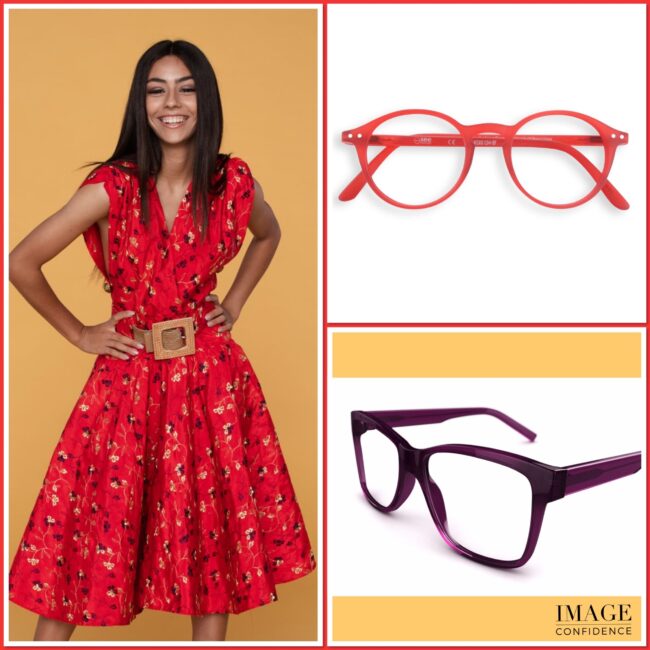
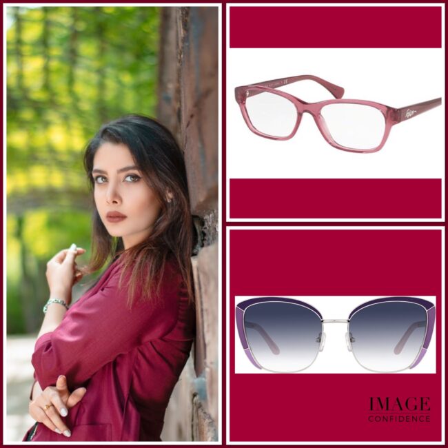
Eyeglass Frames That Complement Your Skin Tone
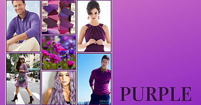
Does your skin have a pinkish hue or does it appear more yellow? Wearing glasses in your optimal shades of red, pink, burgundy or purple will make your skin glow.
Tip: If you have a warm, yellow-based undertone you will also suit orange.
By choosing frames that complement the colours of your hair, skin and eyes you’ll be well on your way to selecting the perfect look for you.
Eyewear images were sourced from Specsavers. This brand also operates in the UK, Ireland, other countries in Australasia and Nordic countries.