Hi, I'd love to give you fresh style tips!

colours

Colour Analysis Interview ABC Radio Sydney

Colour analysis is popular again!

What’s it all about? It’s the practice of draping large pieces of different coloured fabrics under your chin to discover which ones suit your skin tone, eyes and hair. Your best colours make you look healthy and vibrant. The less optimal ones leave you looking sallow and tired, emphasising shadows under your eyes and chin.

Two photos of the same woman. The photo on the left shows her in a white top with no makeup. In the photo on the right, she is draped with colours that flatter her complexion. She is also wearing flattering makeup colours.

Before & After: Colour Analysis

Colour analysis became a global phenomenon in the early 1980s when Carole Jackson’s book ‘Colour Me Beautiful’ was published. The theory used then, is the same theory used today. Your best colours match the intensity, undertone and value of your hair, skin and eyes.  

People were categorised into four seasons: Summer, Autumn, Winter and Spring. These days, colour systems are much more nuanced to accommodate our multi-cultural society. I use a system that has 18 different colour palettes!

Recently, I was interviewed on ABC Radio Sydney Mornings about the rise in popularity of colour analysis again. Many women called or text to share their stories about how knowing their best colours has enhanced their lives.

Two women stand in front of an ABC Radio Sydney sign. The lady on the left is Toni Matthews; radio presenter and interviewer. The woman on the right is Ann Vodicka, a colour analysis expert based in Sydney.

Toni Matthews from ABC Radio Sydney interviews Ann Vodicka about colour analysis and its benefits for you.

This is something many people ask about. If you want to know more, you can listen to the recording here.

If you need help knowing the colours that look fabulous on you, the swatch of colours you receive at your fun two-hour colour analysis session will make shopping for clothes, accessories, makeup and hair dye quick, easy and successful. Plus, you’ll gain more confidence and feel great too!

Sticky
April 13, 2023

8 Ways to Wear Unflattering Colours

Unflattering colours will leave you looking washed out, ill or tired, or even a funny shade of orange (like you have jaundice) – gasp!

Have you ever been asked, “Are you feeling ok? You look a bit tired.”? And actually, you were feeling fine right up until the time they posed the question! 🙁 Chances are, the colour you wore that day was not one that suits your skin tone.

Wearing colours that compliment your complexion, hair, and eyes not only enhances your appearance but also contributes to you feeling good. When you like what you see in the mirror, it elevates your self-esteem and confidence, positively influencing your mood, setting you up for a great day.

Do you instinctively know when a colour is flattering or unflattering on you? Many of my clients answer this question with, “Umm, sometimes… It’s a bit hit and miss.”

A few reasons why you might wear unflattering colours

  • There are times you are drawn to colours that make you look less than amazing. If you’ve had a personal colour analysis, you’ll know which hues to avoid. But occasionally, there will be a strong desire to wear them anyway. (Colour psychology usually plays a part here.)

One of my dear image consultant friends, Bec, suits cool, blue-based colours. Orange is not an optimal colour for her, yet 2 years ago, all she wanted to do was wear orange. Bec was going through a rough patch and feeling flat, and she needed an uplifting energy boost. The excitement, enthusiasm, and warmth of orange was just what she craved and needed.

  • Another reason you might be wearing unflattering colours is you’ve had a personal colour analysis and know your optimal colour palette, but now you’re in the process of replacing clothes that are in unflattering colours. (This transition takes time.)
  • Your employer has issued you a uniform with no choice of colour or style.
  • A specific colour, e.g., lilac, has always been your favourite, yet it washes you out. Lilac becomes a hot trend for the season. It’s available in all the fashion outlets, and you’re desperate to wear it.

How to Wear Colours that are not your Best

  1. Wear the colour on your lower half, away from your face. e.g., shoes, pants, skirts, a belt.

2. If the unfavourable colour is near your face, e.g., a blouse, wear a scarf or a large piece of jewellery close to your face or around your neck in one of your best colours.

3. Wear the colour in small portions, e.g., Hints of the colour in a pattern (less than 20%). Or, accessories, like a belt, small earrings, ring, bracelets.

For example, Rebecca’s colour palette (called ‘Refined’) consists of light, bright, cool colours. Silver and white gold are her best metals, yet she loves the current yellow gold trend. So, Rebecca buys sandals and some bracelets in yellow gold. These items are worn away from her face and only make up a small portion of her outfit. Her cool colours are still near her face, which makes her look healthy and vibrant. Win, win!

Other Ways to Wear Unflattering Colours

  1. Create your outfit using 80% or more colours from your personal colour palette.
  2. Keep in mind your value, colour and ideal contrast levels. Ask yourself: Is the outfit overall too light or dark? Is there too much or too little colour? Are there the right mix of light, medium and dark colours for me? (If you have had a personal colour analysis you’ll know what I’m talking about)
  3. If it’s a top that’s the wrong colour, go for a lower neckline, so the colour is further away from your chin and doesn’t reflect onto your face.
  4. Wear fabric that is sheer so we can see your skin through it.
  5. If you wear makeup, add a bold shade of lipstick in one of your best colours. Our attention will be drawn away from the unflattering colour to the bold, beautiful colour on your face.

There’s always an abundance of colours to choose from when shopping for your wardrobe or selecting makeup and hair dye. This can make your shopping experiences and decision-making frustrating, overwhelming, and time consuming. It’s very easy to choose unflattering shades! If you would like to know my professional opinion on your best colours and receive a fandeck (swatch) of those colours to have as a guide so you always pick colours that make you look vibrant and healthy, check out my Personal Colour Analysis page.

Sticky
September 22, 2021

3 Top Tips For Wearing Green

These 3 top tips for wearing green will help you to identify your best greens, explain what different shades of greens mean, and suggest winning colour combinations to wear with it.

Many people avoid wearing green because they think it’s difficult to mix and match with other colours. Read on, and I’ll share some ideas.

Which Greens Should You Wear?

Firstly, you need to know that there are warm and cool versions of green. Look at the 2 images below. Notice how the warm greens sit next to yellow on the colour wheel. And, the cool greens sit next to blue on the wheel. One group will suit your complexion more than the other.

A photo of a colour wheel.

A selection of warm green and cool green dresses.

Words like khaki, olive, fern, Kelly green, chartreuse and moss are often used to describe warm greens. Whereas cool greens have names like forest, mallard, emerald, mint, teal, and bottle green.

“Which ones suit me?” I hear you ask. Try this fun exercise to find out:

Compare one of the warm colours with one of the cool colours by placing them, (one at a time), underneath your chin. Which one makes you look pale and tired? Which one makes you look healthy and vibrant? Healthy and vibrant wins!

What Green Means

“Green strongly influences the heart and helps alleviate tension. Positive qualities associated with green are generosity, humility, and cooperation…” Tae Yun Kim

Colour psychology is the study of the many ways colours affect how we feel and how others perceive us. Here are words to describe 4 shades of green and their symbolism.

  • Deep greens, like seaweed and bottle green = reliable, strong, tenacious
  • Lighter, brighter greens, like lime and mint = cheerful, playful, fun
  • Grey greens, like khaki and sage = wisdom, trust, nurture
  • Emerald and jade greens = lively, sophisticated, regal

It’s interesting to know what messages your choice of green clothes and accessories are communicating to others. And, depending on how you feel on a particular day you can choose a green to match.

Want to know more about other colours and their meanings? Click here.

Woman wearing forest green jacket

Tip #3 For Wearing Green – Colour Combinations

How to wear green when it’s a colour you’ve shied away from in the past? Here are some suggestions:

You’ve seen that yellow and blue sit either side of the green on the colour wheel. Both colours look superb with green. For a fresh weekend look, team blue jeans with a fun lime or cool mint green top.

Other interesting combinations are green and violet, and green and orange. Both the violet and orange can act as accent colours in your outfit, such as a scarf, necklace, or earrings.

An easy way to wear green is in patterns such as florals, stripes, and geometrics. The other colours around it will make the green less noticeable.

Green, white and cream create an energising look for summer.

Tan or charcoal team beautifully with green during the cooler months.

Have a play with these suggestions. Do they make you feel uncomfortable or invigorated, alive, and energised?

Mauve and violet coloured hydrangeas with green leaves.

Nature can be a source of inspiration for your outfit colour combinations.


Are you bamboozled by the overwhelming colour choices in fashion shops and online? Are you unsure about which colours suit you? A personal colour analysis will help you identify your best versions of green and all other colours in the colour spectrum. Make empowered decisions when shopping for your wardrobe. Save yourself time and money, and know you’ll look healthy and vibrant every day. Personal colour analysis changes your life: it’s enlightening and it’s fun!

Display of different shades of green from 5 colour swatches

You will receive a swatch of your best colours at your Personal Colour Analysis Consultation


Image Credits: Avel Chuklanov – Unsplash

Masaaki Komori – Unsplash

Sticky
August 12, 2020

12 Joys of Colour – Part 4

Collage depicting brown items eg coffee, a wooden door and floor, chocolate, brown hair, rocks.

12 Joys of Colour

This is the fourth and final instalment in the 12 joys of colour series.  In this blog I explore two elegant neutrals: brown and grey, and the universal hue: teal.

Day 10 – Brown

Brown is a natural, neutral colour. It’s one of my favourites. 

Have you been to Italy in winter? The Italians ‘do’ brown so well – dark chocolate married with rich caramel and hints of cinnamon. Italian men and women look very stylish walking the cobblestone streets of Rome, Florence, and Milan wearing these hues.

If you are light in colouring i.e. fair skin, fair hair, brown is a wonderful alternative to black – less harsh against your skin. And, with connotations of elegance, reliability, warmth and honesty, there’s a lot to love.

Previously, brown was viewed as old fashioned and ‘suburbia bland’, but not anymore. Now it is considered sophisticated and ‘euro chic’.

There are warm and cool browns. Choose the ones that harmonise with your complexion, hair and eyes. The personal colour analysis system I use helps take the confusion out of knowing which colours look great on you. It simplifies the overwhelm of colour choices and gives you the confidence to know you are choosing your best colours all of the time. In face to face interactions others see you before one word is spoken. Why not make that first impression count?

Collage featuring grey coloured items e.g pebbles, grey coat and blazers, cement building.

Day 11 – Grey

Grey is a sophisticated neutral and a stylish alternative to black.

In its purest form, grey sits on the cool end of the colour spectrum (black + white = grey). However, there are warm and cool versions depending on the colours it is mixed with. Add yellow to pure grey to create warm grey (It looks slightly green). Add blue to pure grey to make cool grey (It looks slightly purple).

Darker greys feel more formal and professional (business suits), whereas medium to light greys feel calm and harmonious (long line cardigans you wear in winter).

Grey is very versatile, so you can wear it with any colour. But if you’re wanting to inject an element of fun and interest into your outfit, combine grey with red, blue, green, yellow or pink.

A great tool you can have is your own personal colour swatch. It will take the guesswork and confusion out of what colours look good on you. If you have warm undertones the swatch will have examples of your best warm neutrals and colours. And, if you have cool undertones it will have examples of the best cool neutrals and colours to suit you.

Peacock, blue-green water, lady wears teal waterfall jacket.

12 Joys of Colour: Day 12 – Teal

Well here we are, at the end of the 12 Joys of Colour. I’ve chosen a hue that suits everyone – teal.

Mix calming blue with healing, optimistic green, and you create teal. Deep versions are understated and elegant. Light versions stimulate creativity and individuality.

Some of you will know that I used to work for Qantas, so anything aviation interests me. And, my mum was a ‘Kiwi’, so this little bit of trivia sparked my interest…

Air New Zealand’s aircraft livery and crew uniforms were teal until 2012. Air New Zealand’s forerunner airline was Tasman Empire Airways Limited (TEAL). Is it a coincidence that the acronym and the airline’s signature colour were aligned? I wonder…

Teal is a very versatile colour. It looks fresh and summery with white, cream and coral, and is ‘lifted’ by gold and silver.

Have the 12 Joys of Colour sparked your interest in discovering your best colours? Feel confident and proud of your image by wearing colours that harmonise with you. (Plus, save time, energy, and your sanity when shopping for clothes). 

Join me in Leichhardt (Sydney) at one of my fun and empowering Personal Colour Analysis Workshops. You can buy your ticket on Eventbrite or by contacting me.

Thanks for coming on this journey with me. Wishing you colour confidence always!


Sticky
February 03, 2020

12 Joys of Colour – Part 3

Collage of red coloured items, such as a red dress, flower and a model wearing a red top and jacket.


12 Joys of Colour:

In the lead up to Christmas 2019 I posted my 12 Joys of Colour series which was inspired by the 12 Days of Christmas. In this blog I explore the 3 primary colours: red, yellow and blue.

Day 7 – Red

Passion, energy, optimism.  Anger, intensity, dominant.

Red is a truly versatile colour which is linked to extremes of emotions, feelings and situations. Bright versions are perceived as being more energetic, and dark shades, more powerful and elegant.

Red sits on the warm side of the colour spectrum. Warm hues advance and draw our attention – think stop signs and fire trucks. This is an interesting fact to remember when dressing in red because wherever you wear it people will pay attention. E.g. Trying to hide your thighs? Red pants will emphasise that area. Instead, wear a red top and draw the eye up and away from your bottom half.

Pantone, the world’s leading authority on colour and colour trends has recently released their predictions for Spring/Summer 2020. One of those colours is youthful and empowering ‘Flame Scarlet’ (featured in the top right corner of the collage). The great news is that this hue looks good on almost everyone! If you’ve shied away from this bright version of red in the past, perhaps next Spring will be the perfect opportunity to try it.

How do you feel wearing red? Conspicuous? Confident? Determined? Energised?

Images: Pantone, Unsplash, Pinterest


Collage of different tints, shades and tones of blue.For example, blue sky and tropical blue water.

Day 8 – Blue

Writing about blue I’m thinking of summer happiness: blue skies and warmer weather. Also, the relaxed, holiday feeling you get when you see azure, turquoise blue waters at tropical destinations like Cairns and Hawaii. Wearing lighter versions of blue evokes a sense of playfulness and fun.

When I think of deep blues, other associations come to mind like trust, authority and power e.g. police uniforms and business suits.

Classic Blue is Pantone’s 2020 ‘Colour of the Year’. Leatrice Eiseman, executive director of Pantone said, “When we look at the world around us, we know that we’re living with a lot of unrest… Blue… has always represented a certain amount of calm and dependability… this particular shade really gave us that feeling of confidence and stability.”

Even though blue is a colour, i.e. not a neutral, it works well for the basic garments that are the ‘work horses’ (essentials) in your wardrobe, like pants, jackets, skirts and jeans.

Choose your best versions of blue by taking your unique colouring (hair, skin and eye combination) into account. That way you’ll always present the best version of you and feel good about your clothing choices.

Images: Pinterest, lifewire.com, uniqtravel.com


Collage featuring the colour yellow. For example: a cut lemon, a lady standing in a field of wheat and a yellow flower.

Day 9 – Primary Hues: Yellow

Hello to happy, cheerful, optimistic yellow!

If you’re feeling mentally exhausted and there’s still a lot to do, wear a small amount of yellow (it could be in a pattern) to stimulate your mental activity and concentration levels.

Yellow is a warm, bright hue that vibrates on a high frequency, so it grabs our attention. Even though most of us think of its positive connotations, many people shy away from wearing yellow because it can feel intense or overwhelming – especially if you’re experiencing major changes in your life.

There are versions of yellow to suit everyone from soft, icy lemon to vibrant canary. During a colour consultation at Image Confidence we compare 18 different colour groups to identify which colours harmonise best with your complexion, eyes and hair. You receive a swatch (mini fan-deck) of 40+ colours to use as a guide when shopping for your wardrobe.

Red, blue and yellow are just some of the colours in your palette that will have you looking good and feeling great!

Images: Pinterest, Unsplash


Contact me if you would like to feel empowered and self-assured about your image in 2020.

A Personal Colour Consultation is fun and is an investment in you.


Sticky
January 12, 2020

12 Joys of Colour – Part 2


12 Joys of Colour:

My version of the 12 days of Christmas to share vibrancy and happiness in the lead up to the festive break.

Day 4 – Orange

Orange sits on the warm side of the colour wheel.

It’s a mixture of strong, passionate red with the sunny optimism of yellow.

Orange is one of my favourite colours. When I wear it and see it, I feel energised and happy!

People with warm or neutral skin undertones can wear this colour successfully. If you have a cool undertone orange will make you appear jaundice rather than healthy and radiant.

One of my recent clients, Bronwyn, came for a colour consultation. We discovered that her best colours were cool colours. Bronwyn said she’d been yearning to wear orange and was disappointed that it was not in her colour palette. (Sometimes we just need to wear a certain colour because of the way it makes us feel.)

I suggested 3 ways that she could wear orange and still look good:

  • Wear it below your waist
  • Use only very small amounts
  • Wear one of your optimal colours in-between it (the orange) and your face


Collage featuring gold earrings, bag, shoes and woman with gold coloured finger nails.

Day 5 – Gold

Sparkle and Glamour…

We associate the colour gold with quality, sophistication, luxury and success.

Wear gold if you have warm undertones. If you have cool undertones wear silver.

Like all precious metals, gold accessories will add interest to a plain outfit. It will be the focal point of the outfit so ensure you place it where you want people to look i.e. around your neck so they are drawn to your face, or around your waist if your waist is an asset.

If you find yellow gold too showy opt for the more subtle versions: brushed gold or rose gold.

Gold pairs beautifully with warm neutral tones like chocolate, olive green, khaki, rust, taupe and caramel.

How bold or how subtle should you go? You decide. Make a statement of ‘full blown glamour’ (think of the long evening dresses you see on the red carpet or Bollywood), you can wear it in the form of subtle sophistication (like simple gold and diamond studs worn with a black dress), or you can choose something in-between.


Collage with men and women wearing purple clothes. Also, purple colour swatches and flowers.


Day 6 – Purple

Purple is a combination of 2 primary colours: red and blue. When you look at a colour wheel or colour spectrum you will see that purple is called violet.

Centuries ago the ingredients to produce purple dye was so rare and expensive that only the very rich could afford it. Small mollusks, found exclusively in the Tyre region of the Mediterranean Sea (now modern-day Lebanon), were used to make the dye.

That is why we associate mid to deep purples with royalty, luxury and power. Lighter versions, like lavender and lilac, are seen as soothing, romantic and mysterious.

Recently I had a wardrobe audit with Ella and discovered a beautiful purple, navy and white striped skirt with the shop tags still attached. Ella said that even though she loved it, she had no idea of what to put with it. So, I searched through her tops and found a red blouse and a mint green tee – both looked fabulous with her skirt.

Other colours that team well with purple are orange, yellow and other purples.


Book in for your personal colour consultation and wardrobe audit to fall in love with your clothes again, create new outfits from the clothes you already own, and gain a boost of confidence.


Image Credits: Pinterest, Unsplash, Tommy Bahama, weddingbee.com


Sticky
December 16, 2019

12 Joys of Colour – Part 1

,Man and women wear green coloured clothing. Examples of warm and cool green swatches.


12 Joys of Colour is my version of the 12 days of Christmas which aims to share vibrancy and happiness in the lead up to the festive break. Here are the first three colours:
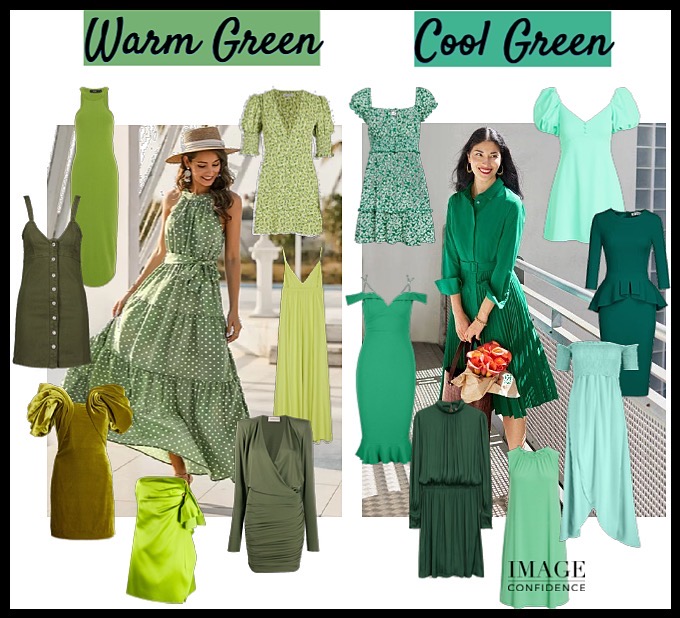
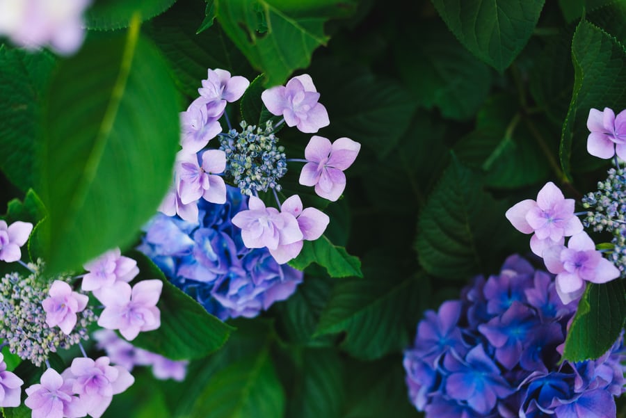
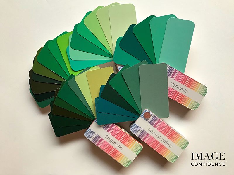
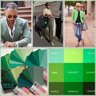
Day 1 – Green

“Green, which is Nature’s colour, is restful, soothing, cheerful, and health-giving.” Paul Brunton

Colour surrounds us. Subliminally, it affects how we feel and how we are perceived. Cultural and personal experiences can also influence the way we view colour.

I’m going to focus on the positive messages green evokes.

Below are some shades and hues of green and how they may be perceived by others and how they might make you feel.

  • Deep greens, like seaweed and bottle green = reliable, strong, tenacious
  • Lighter, brighter greens, like lime and mint = cheerful, playful, fun
  • Grey greens, like khaki and sage = wisdom, trust, nurture
  • Emerald and jade greens = lively, sophisticated, regal

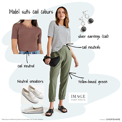
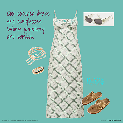
So what colours team well with green?

When I take clients out on personal shopping trips I quite often pair green with blue (navy especially), purple, brown and tan, charcoal, yellow and other versions of green.


Man and women wear white clothing. Swatch samples of different tones of white.


Day 2 – White

Ivory, snow-white, snow, milk, milky-white, chalk, pearl, antique white, chalk, seashell, cream, linen, ghost white, beige, cornsilk, alabaster.

These some of the words we use to describe the many variations of white.

Classed as a ‘neutral’, white is a blank canvas that allows other colours to shine. It is ideal to use in your home and to have in your wardrobe.

Have you ever searched for white paint? You were probably shocked to discover that there are thousands of shades of white paint available. And, you would have worked out pretty quickly how important it was to choose wisely because it influenced how the room looked and felt e.g. bright, warm, cold.

The same applies when you choose your white clothing. There are very few people who can wear pure white successfully. Many of us look tired, pale and sick in pure white. Instead, wearing a soft white (white with a tiny drop of yellow, umber, grey or green added) compliments your complexion and gives you a healthy glow.

If you would like to see how soft white looks on you, dye one of your white tee-shirts in tea. It’s simple to do: Fill a large saucepan with water and bring to the boil. Steep two teabags in the water for 15 minutes. If you want a light, yellowish colour use green or white tea. If you’re wanting something a little darker, use black tea.

I feel calm, fresh, stylish and relaxed wearing my versions of white. How does white make you feel?
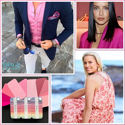
 

Man and women wear pink clothing. Swatches of various tints, tones and shades of pink.


Day 3 – Pink

“Pink is the new black.” Diana Vreeland

Known universally as the colour of love, pink was once seen as a ‘girls only’, sissy hue.

But social attitudes have evolved and pink is more widely accepted as a colour for everyone. As an image consultant and personal stylist I’ve found that there can be resistance to wearing pink, but generally, once all of the other elements of the outfit are added there is a change of heart.

Pink is a wonderful mix of red and white – the white subduing the fiery energy of red.

Dark pinks can have similar effects to red. Viewed as strong and bold, dark pinks can heighten emotions. On the other hand, paler pinks are perceived as soothing and approachable.

Salmon, coral, hot pink, fuchsia, blush, flesh, flush, fuchsia, rose. Which is your best version of pink? Is it pale, cool and icy, a yellow-based coral, or more vibrant and striking like fuchsia? Match it to your complexion and your skin will glow.

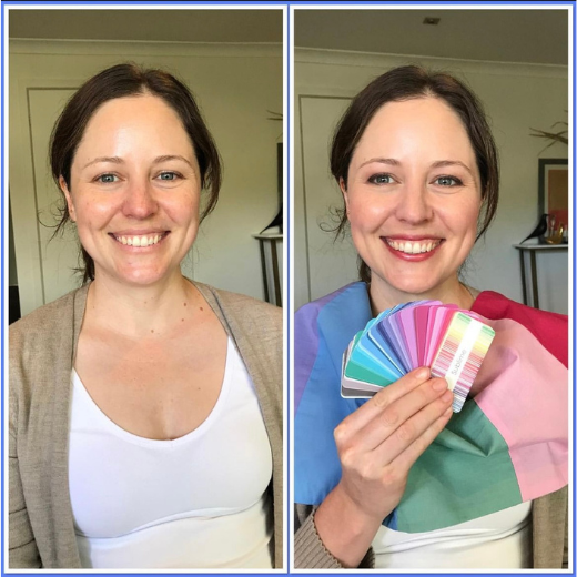
Book in to have your Personal Colour Consultation


Sticky
December 15, 2019

Fashion Colours for Winter 2017 – Your Trend Forecast.

For those of us in the southern hemisphere, we’re in the thick of winter right now: time to be adding some fun, fashion colours to liven up your day and your wardrobe.

So how do we know what colours are on trend for this season?

Every year fashion colour trends are summarised in reports from world renown colour authority, Pantone. These reports highlight the colours we will see in shops for the upcoming seasons. Forecasts are based on colours showcased at New York and London Fashion Weeks.

Pantone’s Fashion Colour Report for Fall/Winter 2017 has a collection of warm and cool reds, deep port, soft pinks, olive to lime greens, autumn leaf colours like rust, terracotta and spiced mustard and some light to medium cool blues.

Pantone’s New York Fall/Winter Fashion Colours 2017

Use accents of these colours to add interest to your winter outfits. Style with accessories like scarves, earrings, necklaces, ties, hats and gloves. It’s the easiest way to incorporate colour to achieve an on trend look.

If you have warm undertones consider hues like Grenadine, Lemon Curry and Golden Lime. If you have cool undertones choose colours like Blue Bell, Shaded Spruce and Ballet Slipper. Experiment with these fashion colours to discover what works well for you.

Pantone’s London Fall/Winter Fashion Colours 2017

Choosing colours that best suit your hair, eyes and skin tone will have you looking healthy and vibrant even on the greyest of days!

Have you been trying out various warm and cool colours, like those in the Pantone winter colour range, but are still baffled by which colours work for you? A personal colour analysis will eliminate all of the confusion and guesswork. You’ll know your best colours for every season, including this winter.


Discover what colours work for you.


Ann

ann@imageconfidence.com.au

0408 108 804


Sticky
June 27, 2017
css.php