Wondering which colours to wear with brown? The good news is that brown is one of the most versatile colours in your wardrobe. Whether you prefer bold combinations or softer neutrals, there are plenty of stylish colours to wear with brown that can help you look put-together, modern and confident.
Brown is having a major fashion moment, and for good reason.
It’s elegant, sophisticated, practical and surprisingly versatile. Whether you’re wearing chocolate brown, espresso, chestnut or cocoa, brown works beautifully with a wide range of colours.
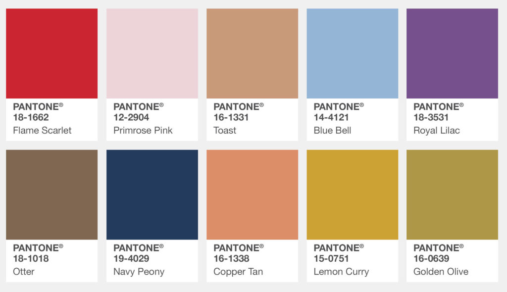
Some of the best colours to wear with brown are:
- Red
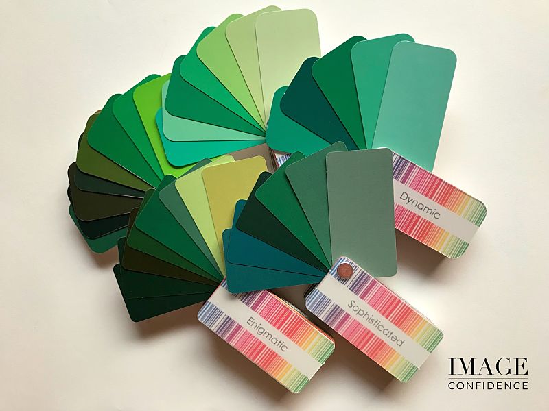
• Olive Green
• Light Blue
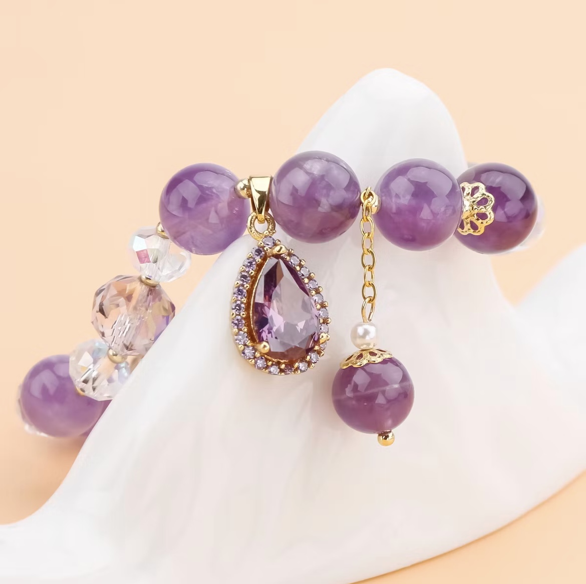
• Purple
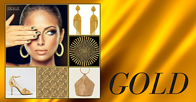
• Camel
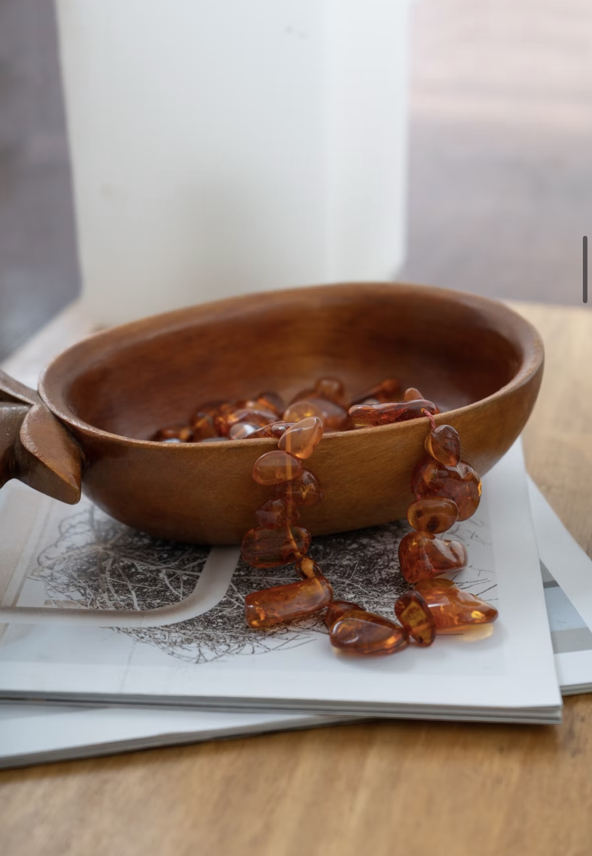
• Burgundy
• Navy Blue
• Yellow
• Soft White
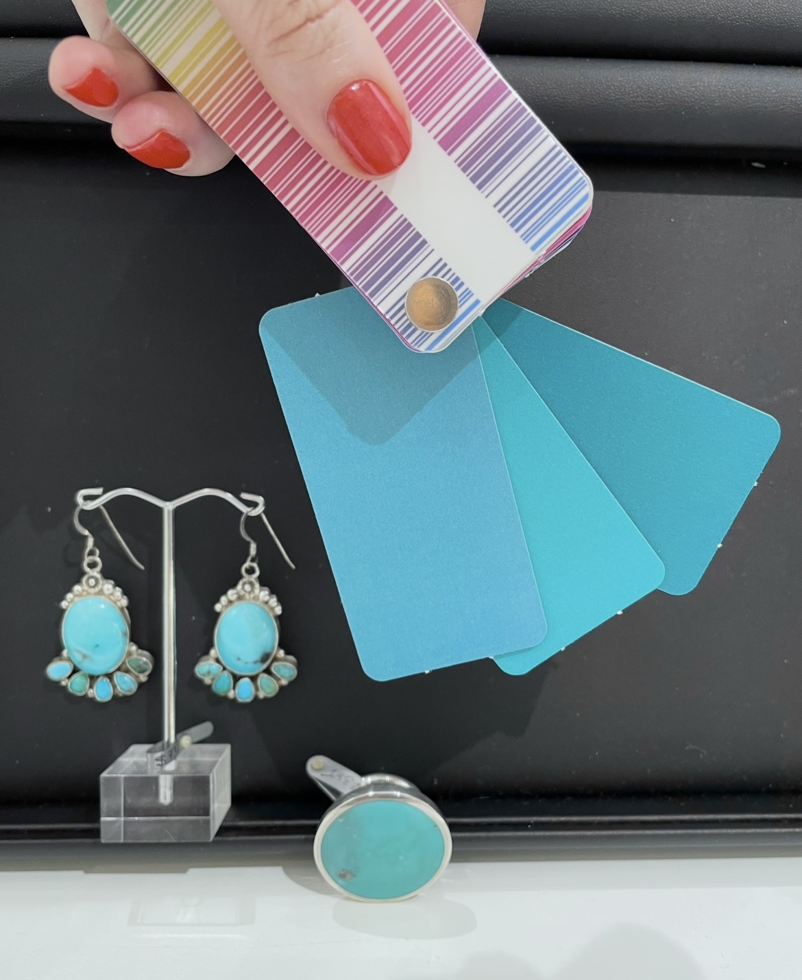
• Teal
• Light Pink
Let’s explore each combination.
Which of these 11 colours would you pair with brown?
-
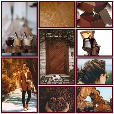
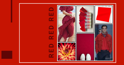
Brown and Red
Brown and red create a rich, confident combination that feels warm and polished.
I love pairing chocolate brown with a tomato red, brick red or warm berry shade. It’s a combination that feels stylish without trying too hard.
-
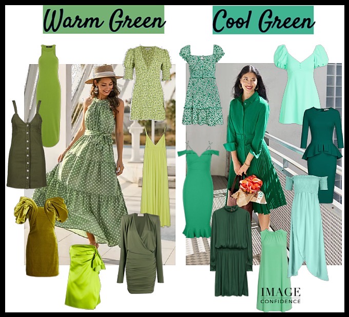
Brown and Olive Green
These colours naturally belong together.
Both are inspired by nature, which makes the combination feel grounded, relaxed
and easy to wear.
Olive green (light or dark) works beautifully for casual outfits, travel wardrobes and weekend dressing.

-
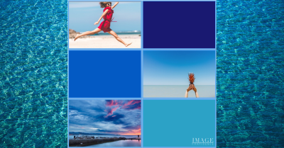
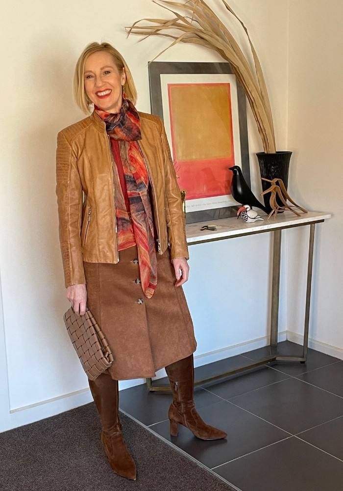
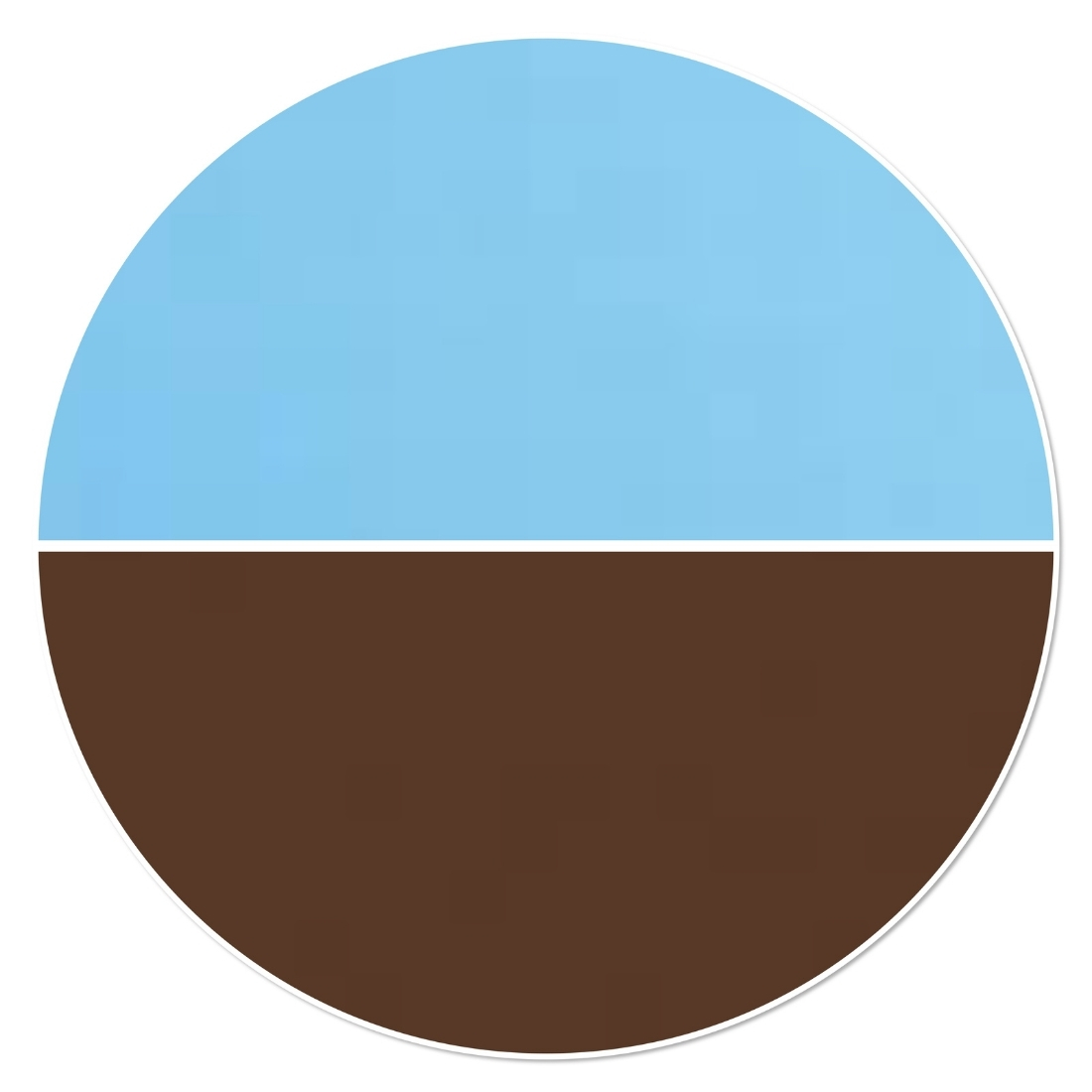
Brown and Light Blue
Light blue brings freshness and lightness to brown.
It’s a combination that feels modern, approachable and easy to wear.
-
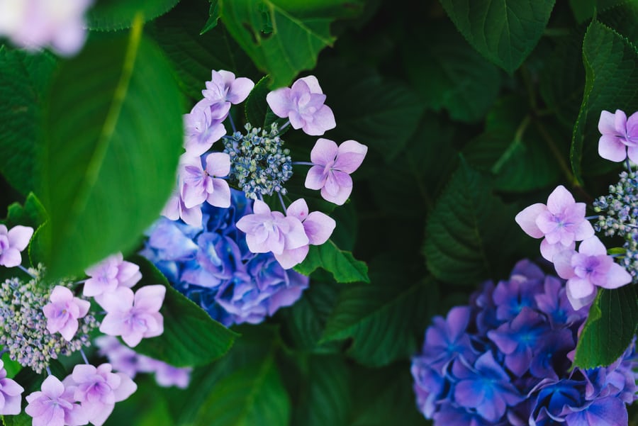
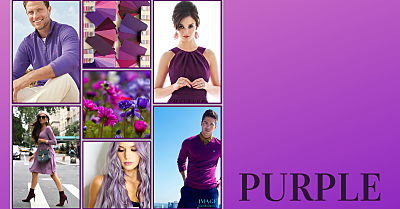
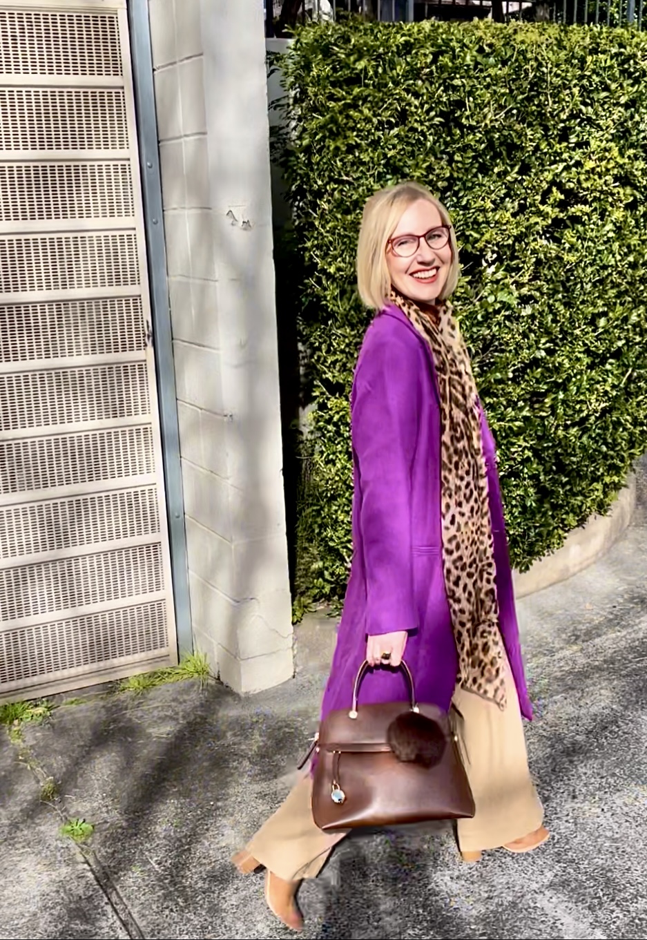
Brown and Purple
Purple adds sophistication to brown.
Whether you choose plum, aubergine or a softer violet shade, the contrast creates interest while still feeling elegant.
- Brown and Camel
This is one of the easiest colour combinations to wear.
Because both colours sit in the same family, the result feels expensive, coordinated and effortless.
-
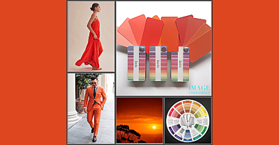
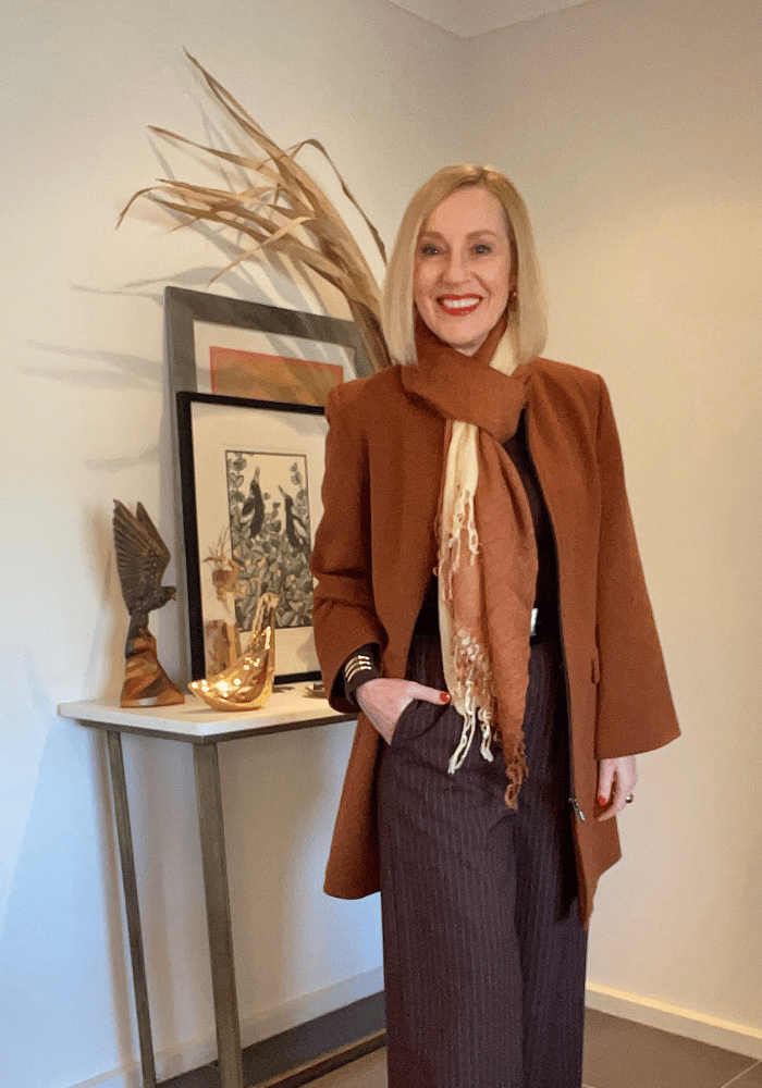
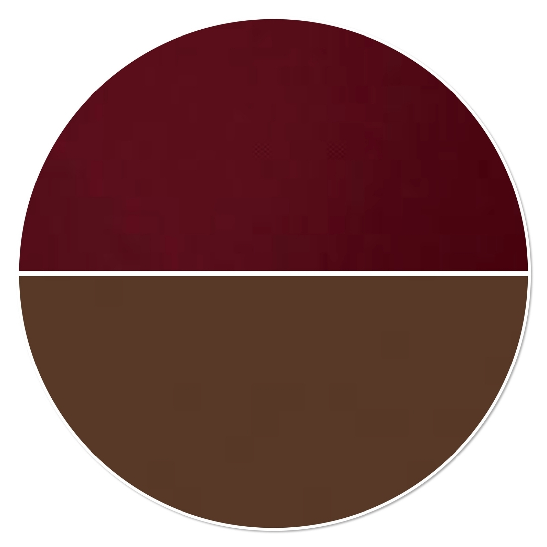
Brown and Burgundy
If you’re looking for something a little more dramatic, burgundy is a beautiful choice.
Together, brown and burgundy create depth, elegance and a luxurious feel.
-
Brown and Navy Blue
Many women assume brown and navy shouldn’t be worn together.
In reality, they create a chic and timeless combination.
Navy brings depth while brown softens the overall look.

-
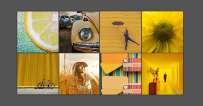
Brown and Yellow
Yellow instantly brings energy and warmth to brown.
Mustard, golden yellow and saffron are particularly flattering choices.
-
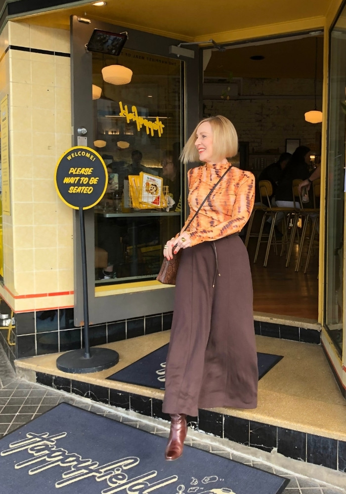
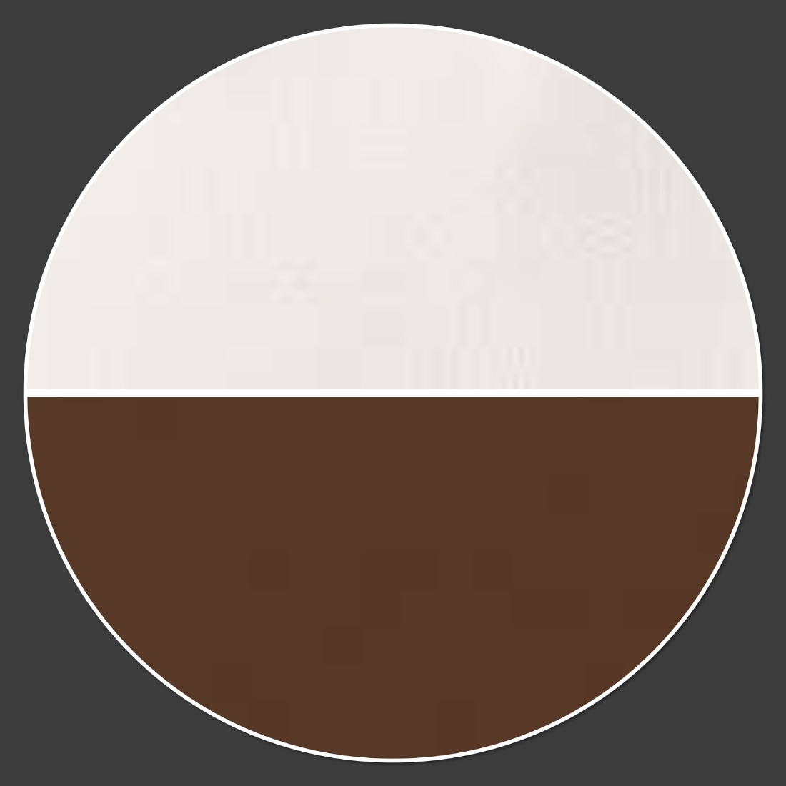
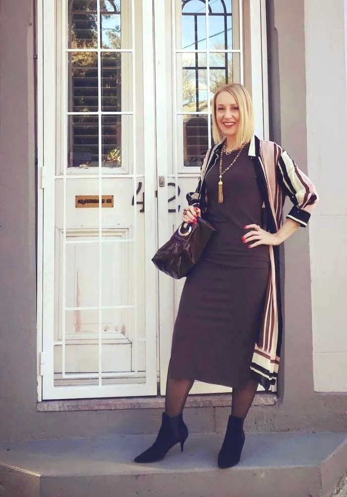
Brown and Soft White
Soft white creates a fresh, elegant contrast with brown.
The combination feels lighter and more approachable than stark white and black.
-
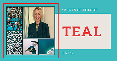
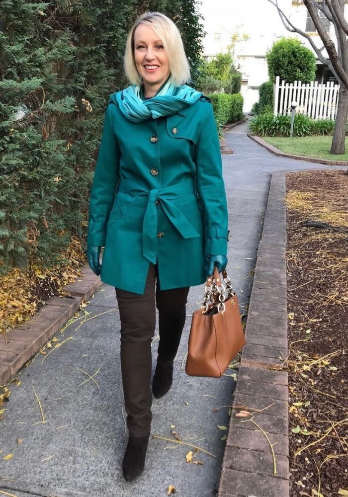
Brown and Teal
Teal is one of my favourite colours to pair with brown.
The richness of teal complements brown perfectly while adding vibrancy and personality.
-
Brown and Light Pink
Light pink softens brown beautifully.
It’s feminine without being overly sweet and works particularly well during spring and summer.
Does Everyone Suit All Versions of Brown?
The short answer is no.
Some women look incredible in warm browns. Others suit cooler versions of brown.
The undertone, depth and intensity of brown that suits you best depends on your natural colouring.
This is why two women can wear the same brown jumper and have completely different results.
If you’re unsure which shades of brown work best for you, a colour analysis can provide clarity and save years of expensive trial and error.
Discover your most flattering colours with a professional colour analysis.
Final Thoughts
As you’ve seen, there are many beautiful colours to wear with brown. Whether you love red, teal, yellow, navy or soft pink, brown provides the perfect foundation for stylish and versatile outfits.
And that’s always a good thing!
P.S. If you’re interested in the psychology of colour and specifically about colour and emotion, this article from Psychology Today provides an interesting overview.