Video calls have become a common way of connecting with each other. Online platforms like Zoom, Skype, and FaceTime are very convenient. Now we can schedule business meetings, webinars and personal catch-ups with people across the globe. You can look your best on virtual meetings and virtual get-togethers by following these quick and easy tips.
Looking good on video calls: Colour
1. Wear mid-tone colours. Very light or very dark colours have a tendency to make you look washed out.
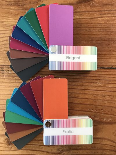
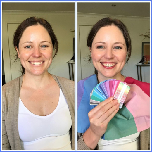
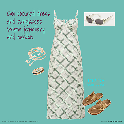
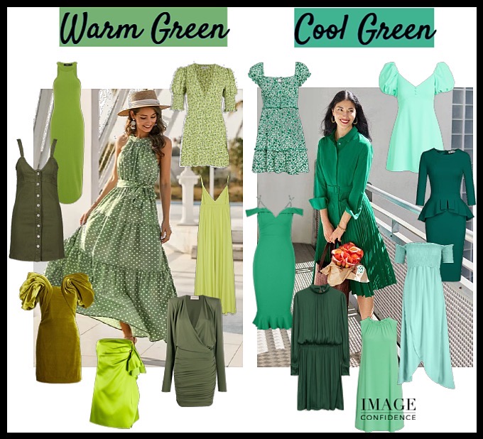
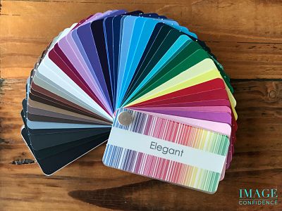
An assortment of warm and cool medium value colours that are perfect for looking great on video calls.
2. Choose clothes that are different in colour to your background. On a recent video call, someone I was talking with was wearing black, and the curtain behind her was black, leaving ‘just a face’ on the screen. That might be a great look for theatre, but video meetings shouldn’t be that dramatic!
Bonus tip: Have a look at what’s behind you. Keep your background uncluttered, and clean and tidy as possible. You want everyone to be focused on the conversation.
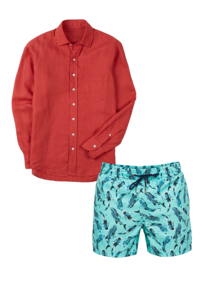
3. Solid colours are easier on the eye. And, it’s best to avoid stripes as they tend to look fuzzy on the screen. Also, loud, multicoloured patterns can be distracting. Patterns that are dense and small to medium in size work best.
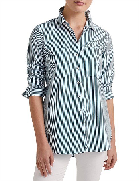
Stripes can appear fuzzy on screen.
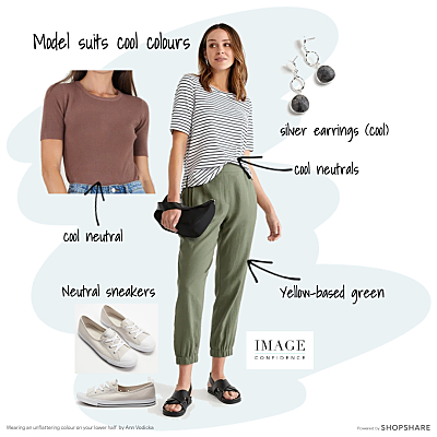
4. Wear colours that work in harmony with your hair, skin and eyes. These colours will ensure you create maximum visual impact. Before you have a chance to speak, people will subconsciously judge your appearance and your non-verbal cues (posture, facial expression, body language) – make yours a positive first impression.
Style suggestions for looking your best during online calls
5. Your main focus should be dressing your portrait area. From the top of your head to about your mid-section is generally all we’ll see. But I recommend considering what you wear below that area as well. If you have to get up in a hurry and don’t have time to turn off the camera you want to dress so that you won’t embarrass yourself and it won’t be a shocking sight for everyone else on the call.
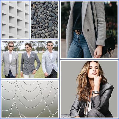
6. Dress authentically so you feel confident and comfortable is very important. So too, is dressing appropriately. For example, if you are on a business call, wear an outfit that you would normally wear to work. That way your mindset is in work mode, you look the part and your work colleagues and/or clients know it too. (A blazer and a solid coloured top always look professional.)
Remember, your clothes send subliminal messages. Think about how you want to be perceived when you’re dressing for video calls. Even if the call is for social reasons it’s a great idea to look ‘put together’. You’ll feel more confident and everyone else will appreciate the respect you’re showing them by making an effort.
7. If you wear jewellery to keep it fairly simple: The focus needs to be on your message, not on your adornments.
8. Still on the topic of jewellery: avoid wearing stacks of bangles which can be noisy when you move your arms. If you’re using headsets, dangling earrings could hit the earpiece and cause noise distraction.
Grooming
9. Hair should be neat and clean. If you’re really pushed for time just make sure that the front view of your hair is the way you want it. No one will see the back of you. If you’re prone to playing with your hair, pull it back in a simple ponytail or low bun to stop yourself from playing with it.
10. Not everybody likes to wear makeup, but a mid-tone lipstick or lip gloss and a bit of blush will help define your features. It also helps to keep the focus on your primary communication zone.

Wearing a mid-tone lipstick draws attention to your face – your principle communication zone.
11. Be wary of your neckline. If it’s too low, you might feel self-conscious and find it difficult to concentrate.
Look your best for online calls; Lighting and camera position
12. Make sure there’s optimal light. Natural light is best, but daylights, softbox lighting or a ring light can produce similar results. The light source should be in front of you. Avoid sitting directly under a light source as it will cause deep shadows (especially under your eyes).
13. Position the camera at eye level or slightly above. This gives others the feeling that you are sitting opposite the person you are talking to – just like a face-to-face conversation. An easy way to achieve this is to position your device on a stack of books or a small box. If the camera is below you it will create an unflattering, distorted view. This angle can create double chins that you didn’t know you had!
14. Even lighting is key. Use a portable ring light if you are unable to move your seating position and one side of you is in shadow. These are inexpensive and widely available. Just like the way you elevate your computer or phone, you can set the legs of the light on a stack of books or a box to achieve optimal height.
15. Clean the camera lens before the video calls start so that the image others see is clear.
16. Finally, check yourself on the screen before turning the video function on. This gives you time to make any adjustments or tweaks to your appearance before you are in front of others.
Image Credits: Andriyko Podilnyk, Honest Company, Visuals – Unsplash