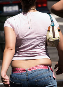
Unflattering colours will leave you looking washed out, ill or tired, or even a funny shade of orange (like you have jaundice) – gasp!
Have you ever been asked, “Are you feeling ok? You look a bit tired.”? And actually, you were feeling fine right up until the time they posed the question! 🙁 Chances are, the colour you wore that day was not one that suits your skin tone.
Wearing colours that compliment your complexion, hair, and eyes not only enhances your appearance but also contributes to you feeling good. When you like what you see in the mirror, it elevates your self-esteem and confidence, positively influencing your mood, setting you up for a great day.
Do you instinctively know when a colour is flattering or unflattering on you? Many of my clients answer this question with, “Umm, sometimes… It’s a bit hit and miss.”
A few reasons why you might wear unflattering colours
- There are times you are drawn to colours that make you look less than amazing. If you’ve had a personal colour analysis, you’ll know which hues to avoid. But occasionally, there will be a strong desire to wear them anyway. (Colour psychology usually plays a part here.)
One of my dear image consultant friends, Bec, suits cool, blue-based colours. Orange is not an optimal colour for her, yet 2 years ago, all she wanted to do was wear orange. Bec was going through a rough patch and feeling flat, and she needed an uplifting energy boost. The excitement, enthusiasm, and warmth of orange was just what she craved and needed.
- Another reason you might be wearing unflattering colours is you’ve had a personal colour analysis and know your optimal colour palette, but now you’re in the process of replacing clothes that are in unflattering colours. (This transition takes time.)
- Your employer has issued you a uniform with no choice of colour or style.
- A specific colour, e.g., lilac, has always been your favourite, yet it washes you out. Lilac becomes a hot trend for the season. It’s available in all the fashion outlets, and you’re desperate to wear it.
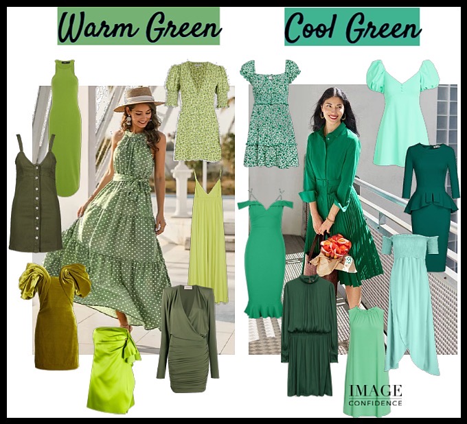
How to Wear Colours that are not your Best
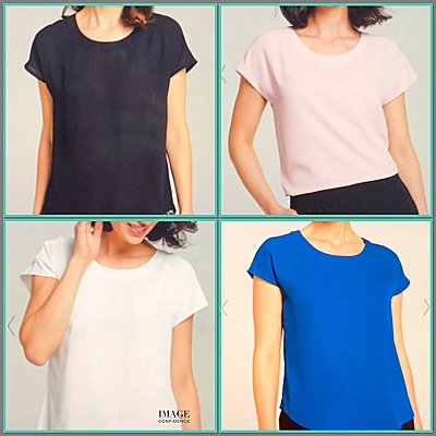
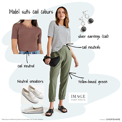
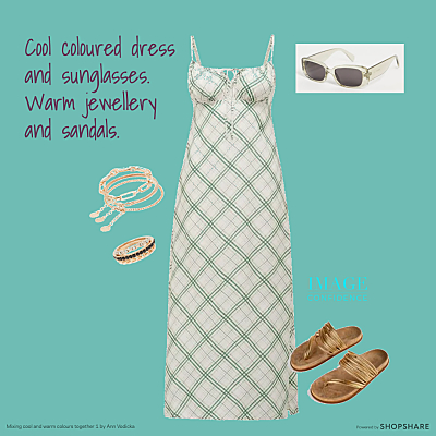
- Wear the colour on your lower half, away from your face. e.g., shoes, pants, skirts, a belt.
2. If the unfavourable colour is near your face, e.g., a blouse, wear a scarf or a large piece of jewellery close to your face or around your neck in one of your best colours.
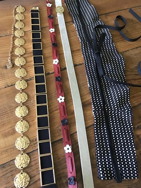
3. Wear the colour in small portions, e.g., Hints of the colour in a pattern (less than 20%). Or, accessories, like a belt, small earrings, ring, bracelets.
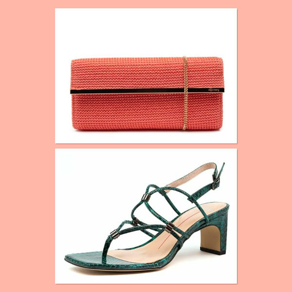
For example, Rebecca’s colour palette (called ‘Refined’) consists of light, bright, cool colours. Silver and white gold are her best metals, yet she loves the current yellow gold trend. So, Rebecca buys sandals and some bracelets in yellow gold. These items are worn away from her face and only make up a small portion of her outfit. Her cool colours are still near her face, which makes her look healthy and vibrant. Win, win!
Other Ways to Wear Unflattering Colours
- Create your outfit using 80% or more colours from your personal colour palette.
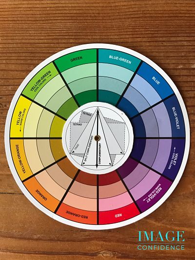
- Keep in mind your value, colour and ideal contrast levels. Ask yourself: Is the outfit overall too light or dark? Is there too much or too little colour? Are there the right mix of light, medium and dark colours for me? (If you have had a personal colour analysis you’ll know what I’m talking about)
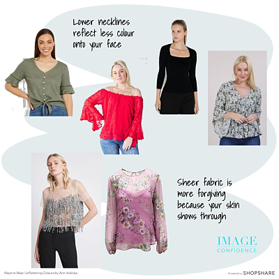
- If it’s a top that’s the wrong colour, go for a lower neckline, so the colour is further away from your chin and doesn’t reflect onto your face.
- Wear fabric that is sheer so we can see your skin through it.
- If you wear makeup, add a bold shade of lipstick in one of your best colours. Our attention will be drawn away from the unflattering colour to the bold, beautiful colour on your face.
There’s always an abundance of colours to choose from when shopping for your wardrobe or selecting makeup and hair dye. This can make your shopping experiences and decision-making frustrating, overwhelming, and time consuming. It’s very easy to choose unflattering shades! If you would like to know my professional opinion on your best colours and receive a fandeck (swatch) of those colours to have as a guide so you always pick colours that make you look vibrant and healthy, check out my Personal Colour Analysis page.